Today I am going to talk about how to choose the correct representation for several types of data. From statistics class you might remember there are three types of data:
- Metric (data can be measured or counted, mathematical operations make sense)
- Ordinal (data can be ordered in a meaningful way, but mathematical operations (+, -, mean) do not make sense)
- Categorical (data can not be ordered, e.g. color, yes/no)
Furthermore, metric data can be divided into discrete and continuous scales. Data can also be one-dimensional or multi-dimensional and in case of several dimensions, these do not need to be from the same type (e.g. you could measure the height (metric-continuous) and the hair color (categorical) and the math grade (ordinal) for several people).
For the purpose of this example I created data to cover all types of data mentioned above (this code and also the code for the plots can be downloaded: plottypes.R):
- Height (metric – continuous)
- Weight (metric – continuous)
- Hair color (categorical)
- Gender (categorical)
- Degree (ordinal)
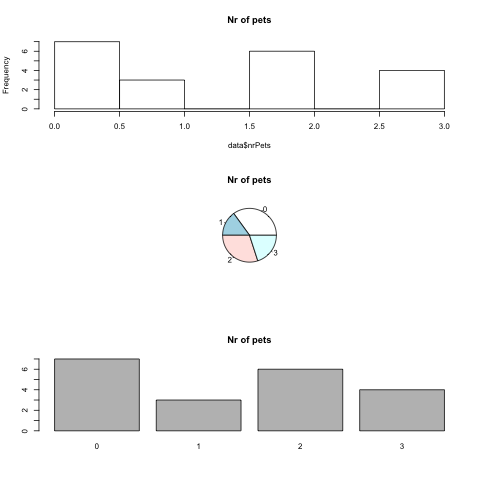
- Nr. of pets (metric – discrete)
gender<-sample(c("m", "w"), 20, replace=TRUE)

menIdx<-which(gender=="m")
womenIdx<-which(gender=="w")

weight<-ifelse(gender=="m", rnorm(length(menIdx), 80, 20), rnorm(length(womenIdx), 65, 10))
height<-weight+100+rnorm(20, 0, 8)

data<-data.frame("height"=height, "weight"=weight, "hairColor"=sample(c("blonde", "black", "brown"), 20, replace=TRUE), "gender"=gender, "degree"=sample(c("None", "High School", "University"), 20, replace=TRUE), "nrPets"=sample(0:3, 20, replace=TRUE))

str(data)
The last line gives the following output:
'data.frame':	20 obs. of  6 variables:
 $ height   : num  173 165 145 180 168 ...
 $ weight   : num  68.3 78 46.8 81.2 71.6 ...
 $ hairColor: Factor w/ 3 levels "black","blonde",..: 3 2 3 3 1 1 2 2 3 2 ...
 $ gender   : Factor w/ 2 levels "m","w": 1 1 2 2 2 2 1 2 1 2 ...
 $ degree   : Ord.factor w/ 3 levels "None"<"High School"<..: 3 1 1 2 3 3 2 3 3 3 ...
 $ nrPets   : int  0 0 3 0 3 2 0 2 3 2 ...
Weight is dependent on gender and height is dependent on weight, because I wanted to get some realistic looking data (after a few adaptions of my parameters I managed to get rid of women with a size > 220 cm ;-)). If there is some unhealthy weight/height combination, do not think to much about it, it is just a random generator!
Height and weight are usually not measured with decimal numbers, but I wanted to point out that they are continuous. For the ordinal data I first used math grade but then I changed it to degree because I thought this would make it easier to justify why you can not calculate with ordinal values. On the other side people should not forget that grades are ordinal and that very often they are used like metric data - that is just wrong!
Contents
One-dimensional data
First, we start with how to treat each of the 3 categories in the one-dimensional case (3 because we will see metric-discrete and metric-continuous are not very different).
Metric
There are basically three ways to display metric data I can think of. The first two are a histogram and a density plot. Both give an overview of how the data is distributed, where it has its peak (mode) and so on. These could also be combined into one graph. The third is a boxplot, which can be seen as a summary of the data (min, max, median, quartiles) and is often very informative.
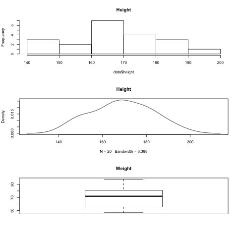
All these plots make sense for metric data because you can compute mean, median and other statistical values in a meaningful way.
For discrete metric data you can do the same, but sometimes it might also be useful to create a pie or bar chart (but only if you have few different values, otherwise a histogram is more useful).
Ordinal
For one-dimensional ordinal data we can not compute the mean or median, but we can look at frequencies. This can be done by a bar or pie chart. A pie chart is pretty straight forward but for bar chart there are several options (like stacked ones or side by side bar charts), but since I actually have never used a bar chart before I am not going into any details.
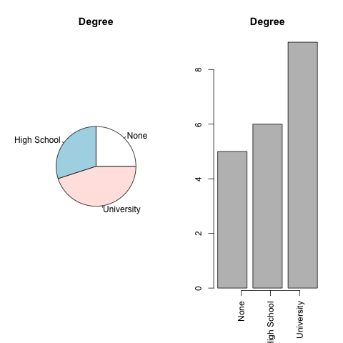
The categories are still ordered (although it is more obvious in the bar chart).
Categorical
The possibilities for categorical one-dimensional data are actually the same as for ordinal data.
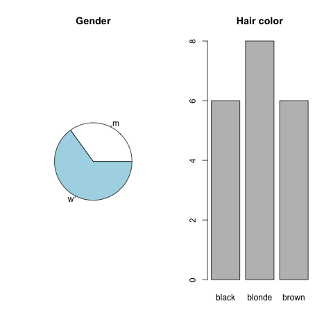
Here the order does not matter anymore.
Multidimensional
Although I am only showing 2-dimensional samples, you can easily extend these samples to include more features. If the dimensions of your data have the same data type (metric, ordinal, categorical) one thing you can do is to do create any of the above graphs with more than one dataset (side by side bar chart, overlapping histograms, side by side boxplot ...). More interesting are the ones if you have mixed datatypes.
Metric/metric
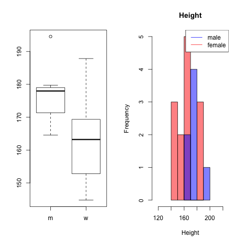
If you consider two datasets that have metric data you can either create a side by side boxplot, or an overlapping histogram / density plot, which helps you to give an overview of the general characteristics (mean, median, variance, ...). Often it is more interesting to see how these values (e.g. height and weight of a person) are related. Therefore you can make an XY-plot.
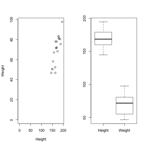
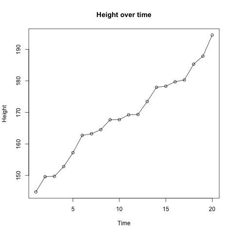
One thing you should consider when plotting metric data in a multidimensional way is whether you use lines to connect the dots or not. E.g. if you use time on the x-axis and want to display the change of time for a variable. In the case of continuous data a line can indicate that there are also values between the dots but they have not been measured. But in the discrete case straight lines do not make much sense. If, for example, the number of pets of one person changed from 2 to 3 between two measurements, a line would indicate 2.5 pets in the middle of these two points in time.
Metric/ordinal
Although in this setting one dataset is metric, a XY-plot is not the best option (I have often seen it but it seems weird). If it is sufficient to see the overall summary of the metric data for each of the values of the ordinal data, separate boxplots can be created.
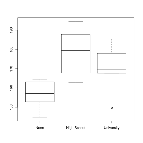
(I know it makes absolutely no sense to compare body height to degree. It is funny though that in my randomly generated sample small people do not have a degree - yet, most likely they are children. ;-))
Metric/categorical
The options are the same as for metric/ordinal.
Ordinal/ordinal, categorical/categorical, ordinal/categorical
For any of these combinations a table is probably the best option.
table(data[,c("gender", "degree")])
      degree
gender None High School University
     m    1           2          4
     w    4           4          5
table(data[,c("gender", "hairColor")])
      hairColor
gender black blonde brown
     m     2      3     2
     w     4      5     4
Final words
- With respect to representation ordinal data is more similar to categorical than to nominal data.
- There are often several possibilities for the data to display. Always think about what you want to convey!
- The source codes for all plots can be found here.
- More on boxplots can be found in a previous post.